The Starting Point
When Chetna first reached out, it was clear she had built something genuinely valuable.
Her work sits at the intersection of functional nutrition and genetics, using DNA insights to guide personalised health decisions. The methodology was strong. The expertise was real. The outcomes were meaningful.
But the website didn’t reflect that.
Despite the depth of her work, the experience felt dense, unclear, and difficult to navigate. Visitors weren’t immediately understanding what she did, who it was for, or why it mattered.
The substance was there. The website just wasn’t keeping up.

The Audit
Before making any changes, I started with a full review of the existing site. Looking at it as a first-time visitor, the core issues became clear quickly.
The structure was flat. Information was presented without hierarchy. Messaging introduced complex science too early, before establishing relevance or outcomes. For someone landing on the site for the first time, it created friction.
It didn’t immediately answer the three questions that matter most:
What is this?
Who is it for?
Why should I trust it?
Nutrigenomics, by nature, is complex. Without the right framing, it can feel abstract or overwhelming. Instead of guiding users into the idea, the site expected them to work to understand it. And most won’t. That was the real problem. Not a lack of information, but a lack of structure.

The Strategy
Once the gaps were clear, the focus shifted to rebuilding the site around how people actually make decisions in this space.
Not around information, but around clarity. Before opening Framer, I mapped the full messaging and structure. The site was rebuilt using a simple hierarchy:
Outcome → Mechanism → Method → Proof → Offer → Decision
This ensured that visitors first understood what improves in their life, before being introduced to how it works. At the same time, the entire page structure was redesigned to guide users step by step:
Clear hero section
Immediate trust signals
Simple explanation of the concept
Defined audience
How it works
Product visualisation
Offer breakdown
Authority and credibility
Testimonials
Final call to action
Every section had a purpose. Every transition was intentional.
The goal wasn’t to simplify the service.
It was to make it understandable.

Simplifying Complexity
One of the biggest challenges in this project was the nature of the service itself. Nutrigenomics is not a simple concept. But complexity doesn’t need to feel confusing.
The key was reducing cognitive load without losing credibility. Instead of leading with technical language, the messaging was reframed into something immediate and clear: A way to understand how your body processes nutrients and responds to lifestyle factors, using your DNA, translated into personalised guidance.
This removed the biggest barrier at the top of the page: “It sounds complicated.” Once that friction is gone, everything else becomes easier to absorb.
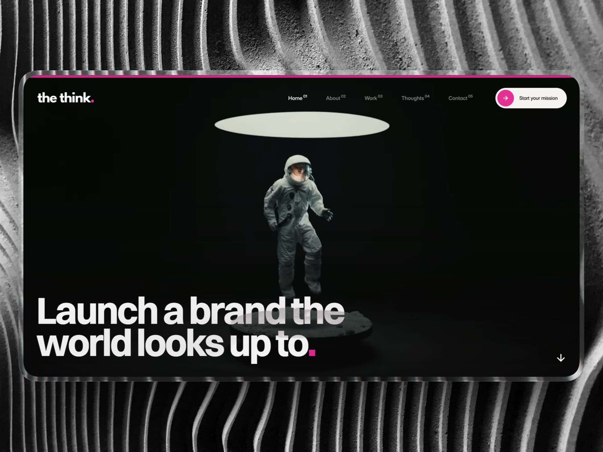
The Build
With the strategy locked in, the build moved into Framer. The design direction was intentional: clean, structured, and built around hierarchy.
Spacing was used to control pacing.
Sections were designed to feel distinct but connected.
Nothing competed for attention.
One of the most important additions was product visualisation. Previously, the service was invisible. Users couldn’t see what they were actually getting.
So a new section was introduced:
Inside Your Health Blueprint
This gave a clear, visual breakdown of:
Nutrient metabolism insights
Stress and neurotransmitter pathways
Detoxification and methylation systems
This shifted the service from abstract to tangible. Something you can see. Understand. Value.
Trust & Positioning
For a premium health service, trust isn’t a supporting element.
It’s the foundation. So the structure was adjusted to reflect that.
Credentials were moved directly below the hero.
A dedicated trust layer was introduced early.
Chetna herself was positioned clearly as the expert behind the system.
The tone moved away from a general wellness feel, and closer to a practitioner-led, clinical authority.
Something that feels considered. Measured. Credible.

Offer Structure
Another key issue in the original site was how the offer was presented. It existed, but it wasn’t clear.
So it was restructured into three defined pathways:
Child Health Blueprint
Women’s Health Blueprint
Precision Health Blueprint
Each with a clear audience, focus, and set of inclusions. This reduced decision fatigue and made it easier for users to see where they fit. Clarity at this stage directly impacts conversion.
The Outcome
The final result is a website that feels aligned with the level of the service behind it. Visitors can now quickly understand:
What the service is
How it works
Who it’s for
Why it’s credible
Complex ideas are broken down into clear, structured sections. The product is visible, not abstract.
And the entire experience follows a natural flow:
Understand → Trust → Explore → Decide
The Takeaway
Most websites in this space don’t struggle because they lack information. They struggle because they present it without structure.
In health, especially, people aren’t just browsing.
They’re evaluating trust.
They’re assessing credibility.
They’re deciding whether to act.
When that process feels unclear, hesitation follows. This project shows what happens when that friction is removed.
When complex ideas are simplified.
When authority is made visible.
When the product is clearly understood.
And when every step of the journey is intentional.
The result isn’t just a better-looking website. It’s one that performs the way it should.