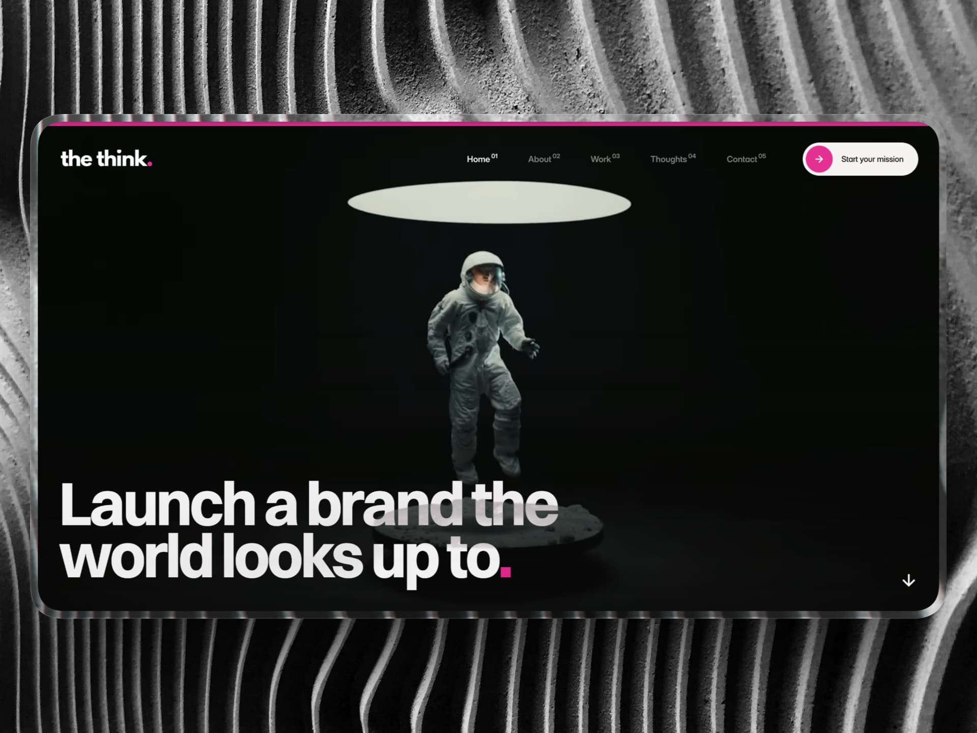
The Starting Point
When Ben reached out, the idea was clear, but the product wasn’t built yet.
CoBuildr is designed to solve a specific problem: helping founders find the right people to build with. Not through cold outreach or scattered communities, but through a more structured, intentional experience. The long-term vision was a full platform. Accounts. Dashboards. Messaging. A complete ecosystem.
But jumping straight into building that would have been the wrong move.
The real question wasn’t how to build the platform.
It was whether the demand was there in the first place. So instead of overengineering early, the goal became building an MVP that could simulate the core experience, validate interest, and create a strong first impression, all within a Framer site.

The Challenge
On the surface, this looked like a standard marketing site. Underneath, it wasn’t.
The core of the experience relied on two things working seamlessly together:
A project submission flow, where founders could post their ideas
A browse directory, where users could filter and explore those projects
Both needed to feel dynamic, structured, and reliable, closer to a product than a typical website. The complexity came from how everything connected.
Each project page needed to be almost entirely populated by CMS data, pulled directly from the submission form. That meant structuring the CMS in a way that could handle variability without breaking layout or clarity. At the same time, the browse experience needed to feel intuitive. Users had to be able to filter projects by industry, project type, and trial possibilities without friction.
No third-party tools. No external systems. Just Framer. Getting that right was where the real work was.
The Strategy
Before touching the build, I mapped the entire experience from both sides.
From the founder’s perspective:
How easy is it to submit a project? What information actually matters? What should be required vs optional?
From the browser’s perspective:
How quickly can someone understand what’s available? How easily can they narrow down options? How clear is each project at a glance?
The structure was built around reducing ambiguity. Projects needed to be consistent enough to scan quickly, but flexible enough to handle different types of ideas. The CMS became the foundation of that balance.
Instead of thinking in pages, the system was designed around relationships:
Form → CMS → Directory → Detail Page
Everything had to connect cleanly.
The goal wasn’t just to “launch a site.”
It was to create something that felt like a real product, even in its earliest version.

The Build
With the structure defined, the build moved into Framer. This is where most of the complexity lived.
The project detail pages were designed to be almost entirely CMS-driven. Content submitted through the form populated everything dynamically — from core descriptions to structured metadata. The challenge was making that flexible without sacrificing visual consistency. At the same time, the browse directory required a fully custom filter system.
Users can sort projects by:
Industry
Project type
After-trial possibilities
All handled natively, without relying on third-party tools. This wasn’t just a visual component. It required careful structuring behind the scenes to ensure filters worked reliably across all combinations, while still feeling fast and intuitive.
The result is a system that looks simple on the surface, but carries a significant amount of logic underneath. On the design side, the direction stayed consistent with the goal: clean, structured, and easy to navigate.
Clear hierarchy. Intentional spacing. Minimal friction.
Something that feels credible immediately, but doesn’t get in the way of the core action: exploring projects.
Throughout the build, Ben was kept in the loop through regular Loom updates, walking through decisions, progress, and tradeoffs as they happened.

The System Behind It
One of the more important parts of this project isn’t immediately visible.
The entire experience is powered by how the CMS and form logic were set up.
Instead of treating the CMS as a static content layer, it was structured as the backbone of the product experience. Every field, every relationship, every piece of data had a purpose.
That’s what allows:
Projects to render consistently
Filters to work accurately
The experience to scale without needing to rebuild
It’s the difference between a site that looks dynamic and one that actually behaves like a product.

The Handoff
Once everything was built and tested, I put together a full handoff system for Ben.
A structured set of Loom videos covering:
How the CMS is organised
How to manage and update projects
How the filtering system works
How to extend the site as the platform evolves
Everything documented clearly.
The goal was simple: no guesswork after handoff.
The Outcome
The final result is an MVP that does exactly what it needs to do.
It allows real users to:
Submit projects
Browse opportunities
Interact with the core idea behind the platform
Without needing to build the full product upfront.
It creates a realistic test environment for demand, while still feeling polished and intentional.
And importantly, it sets a strong foundation for what comes next.
The Takeaway
Most MVPs fail because they try to prove too much, too early. They overbuild. Overcomplicate. Or skip structure entirely.
CoBuildr took a different approach. Instead of building the full platform, we focused on building the right slice of it, the part that proves whether the idea works.
Clear structure. Real interactions. No unnecessary complexity. That’s what makes this project valuable.
It doesn’t just look like a product.
It behaves like one.
And that’s what allows it to answer the only question that matters at this stage:
Is this worth building further?