

When a potential client lands on your website, you have roughly seven seconds to convince them they are in the right place. In the world of professional services, whether you run a consulting firm, a coaching practice, or a specialized agency, those seven seconds dictate the trajectory of your business. The harsh reality is that most service business websites are designed to impress, not to convert. They are built as digital brochures rather than strategic assets, and as a result, they lose qualified leads before the user even touches the scroll wheel.
The first viewport, the area of your website visible immediately upon loading, often referred to as "above the fold", is the most valuable real estate you own online. It is not a canvas for abstract art or vague mission statements. It is a high-stakes environment where clarity must ruthlessly overpower cleverness. In this post, we will dissect the anatomy of a service business website design that converts, explore why the Scandinavian design philosophy of intentionality is your greatest conversion asset, and provide a framework to audit your own homepage today.
The Problem With "Pretty" Websites
The web design industry has a vanity problem. For years, agencies have sold awards instead of results, convincing business owners that complex animations, cryptic headlines, and overwhelming visual elements are the hallmarks of a premium brand. This approach fundamentally misunderstands how buyers of professional services make decisions.
When a user searches for a solution to a high-stakes problem, they are not looking to be entertained. They are looking for assurance. They are experiencing a specific pain point and seeking a specific outcome. If your website greets them with a vague headline like "Empowering Your Future" set against a slow-loading background video of people shaking hands, you have failed the first test of credibility. You have forced the user to work to understand what you do.
In conversion rate optimization, cognitive load is the enemy. Every second a visitor spends trying to decipher your value proposition is a second they are moving closer to the back button. A website design for service businesses must prioritize function over form. This does not mean your site should be ugly; it means every aesthetic choice must serve a strategic purpose. If an element does not clarify your offer, build trust, or direct the user toward an action, it is friction. And friction kills conversions.
The First-Scroll Framework: Clarity, Credibility, and Action
To transform your homepage from a leaky bucket into a client-generation engine, you must master the first scroll. This requires a systematic approach to the three core elements that must be present before the user scrolls down: Clarity, Credibility, and Call-to-Action (CTA). We call this the 3C Model.
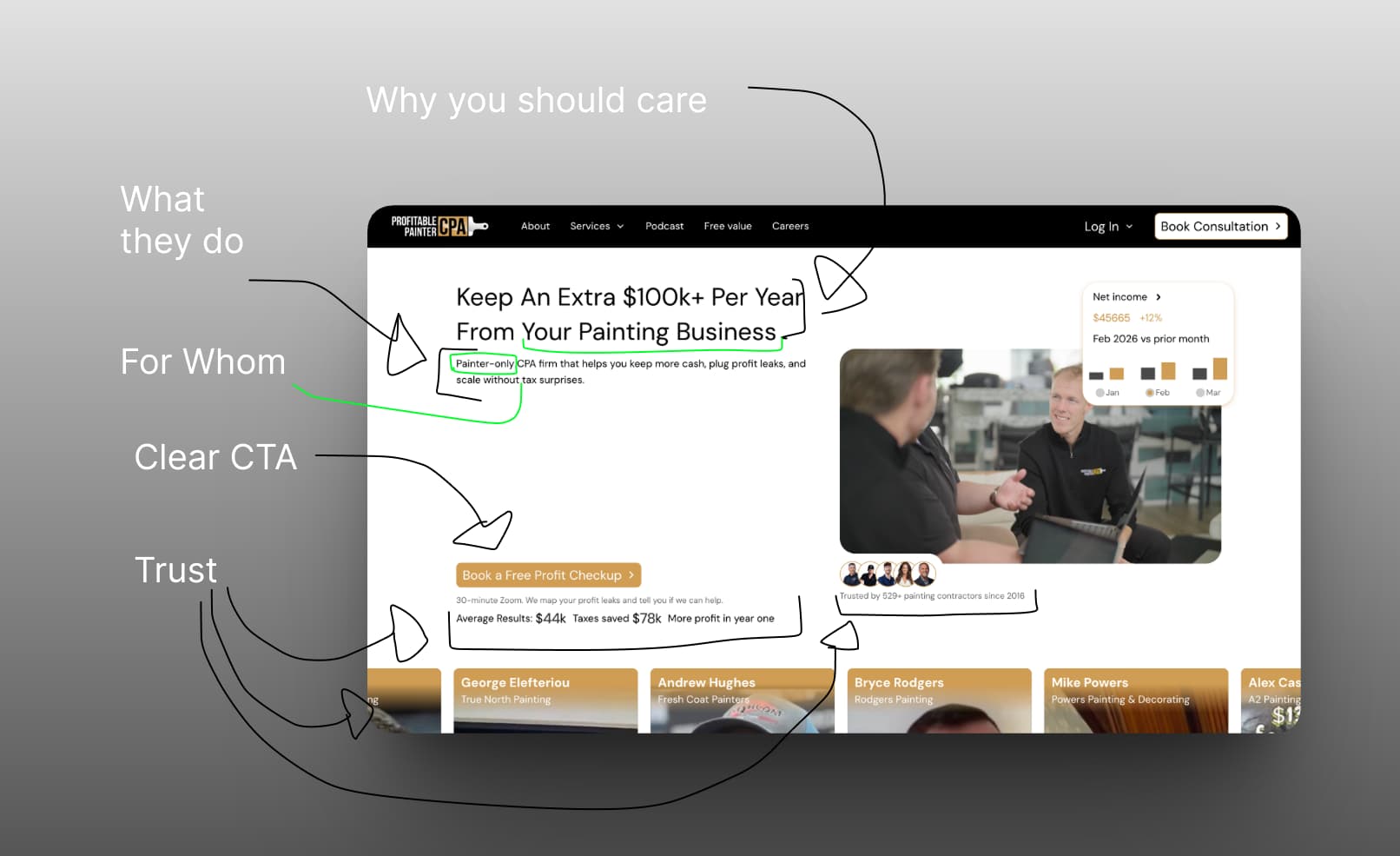
Clarity: Say What You Do, For Whom, and Why It Matters
The most critical component of your hero section is the headline. It must answer three questions instantly: What is the service? Who is it for? What is the outcome?
Many professional services websites fall into the trap of using industry jargon or overly clever copywriting. A consultant might write, "Synergistic Paradigms for Enterprise Growth." A conversion-focused consultant writes, "We Help B2B SaaS Companies Reduce Churn by 20% in 90 Days." The difference is profound. The latter is a clear, outcome-driven statement that immediately qualifies the visitor.
Your subheadline should then expand on the "how." It provides the necessary context to support the bold claim made in the headline. Together, the headline and subheadline form your value proposition. If a visitor reads nothing else on your site, they should still understand exactly why they should hire you.
Credibility: Trust Signals That Work Without Cluttering
In the service industry, you are not selling a physical product; you are selling trust. The user must believe that you can deliver the outcome you promise. This is where website trust signals become critical.
However, cramming your hero section with every award, certification, and five-star review you have ever received creates visual noise. Instead, employ strategic, high-impact trust signals. A row of recognizable client logos (often called a "logo farm") placed subtly beneath the primary CTA is one of the most effective ways to establish immediate authority. If you do not have recognizable logos, a single, powerful statistic or a short, punchy quote from a satisfied client can serve the same purpose.
The key is integration. Trust signals should feel like a natural part of the design, not an aggressive sales pitch. They provide the subconscious reassurance the user needs to take the next step.
The Call-to-Action: One Door, Not a Maze
A confused mind always says no. When you present a visitor with multiple competing calls-to-action, "Learn More," "Read Our Blog," "Follow Us on LinkedIn," and "Book a Call", you dilute the focus of the page.
Your hero section should have one primary objective. For most service businesses, this is initiating a conversation, whether through a consultation booking, a contact form, or a lead magnet download. The primary CTA button should be the most visually distinct element on the screen, utilizing a contrasting color that draws the eye.
The copy on the button also matters. "Submit" or "Click Here" are low-friction but also low-intent. Outcome-focused copy, such as "Get Your Free Audit" or "Schedule a Strategy Session," reinforces the value of taking the action. If you must include a secondary action, it should be visually subordinate, perhaps a text link or a ghost button, so it does not compete with the primary goal.
What Scandinavian Design Gets Right About Conversion
At Frummerin Digital, our approach to web design is deeply influenced by Scandinavian design principles. While often associated with minimalist furniture and neutral color palettes, the core philosophy of Scandinavian design is highly applicable to conversion rate optimization.
The central tenet is intentionality. In Scandinavian design, form follows function. There is no room for superfluous decoration; every element must earn its place. This aligns perfectly with the goal of reducing cognitive load on a website.
Whitespace as a Strategic Tool
In amateur web design, empty space is viewed as a problem to be solved. In professional, conversion-focused design, whitespace (or negative space) is a strategic tool used to guide the user's attention.
Whitespace provides cognitive relief. It allows the user to process information in manageable chunks rather than being overwhelmed by a wall of text and imagery. By surrounding your headline and CTA with ample whitespace, you isolate them, making them impossible to ignore. Research from the Nielsen Norman Group consistently shows that clean, uncluttered interfaces lead to higher comprehension and engagement rates.
The Principle of "Lagom"
The Swedish concept of "Lagom" translates roughly to "not too much, not too little, just the right amount." This is the perfect heuristic for designing a service business website.
You do not need a 5,000-word homepage detailing the history of your firm. You need just enough information to establish clarity and credibility, and nothing more. You do not need complex scroll animations that distract from the message. You need just enough visual hierarchy to guide the eye toward the CTA. Applying the principle of Lagom ensures that your website remains focused on the user's needs rather than your own desire to showcase everything you can do.
The Scroll Test: Auditing Your Own Homepage
Theory is only useful when applied. To determine if your current website is optimized for conversion, you can perform a simple exercise known as the Scroll Test.
Open your website on a desktop computer and a mobile device. Do not scroll. Look only at what is visible in the first viewport. Now, ask yourself the following questions:
The 5-Second Rule: If a stranger looked at this screen for five seconds, could they accurately describe what my business does and who we serve?
The Friction Check: Is there anything on this screen that does not directly contribute to clarifying my offer, building trust, or driving an action? (Look for vague headlines, unnecessary navigation links, or distracting background videos).
The Action Path: Is it immediately obvious what the user should do next? Is the primary CTA visually distinct and compelling?
If you answer "no" to any of these questions, your first scroll is leaking potential clients. The fix is rarely adding more elements; it is almost always stripping away the non-essential until only the core message remains.
Real-World Application: Before and After Thinking
Consider a hypothetical management consulting firm. Their original hero section features a stock photo of a modern office building. The headline reads, "Navigating the Complexities of Modern Business." The subheadline says, "We provide bespoke solutions for enterprise organizations." There are two buttons: "About Us" and "Our Services."
This design fails the Scroll Test entirely. It is vague, lacks credibility, and offers no clear path to conversion.
Now, let's apply the first-scroll framework and Scandinavian intentionality.
We replace the stock photo with a clean, solid background or a subtle, abstract pattern that does not distract from the text. The new headline reads, "We Help Mid-Market Manufacturers Increase Operational Efficiency by 15%." The subheadline states, "Data-driven management consulting that turns operational bottlenecks into measurable profit."
Below the text, we add a single, high-contrast button: "Book a Discovery Call." Just beneath the button, we place a small row of logos from recognizable manufacturing clients with the text, "Trusted by industry leaders."
The transformation is stark. The new design is not necessarily "prettier" in a traditional sense, but it is infinitely more effective. It immediately qualifies the visitor, establishes the value proposition, provides a trust signal, and offers a clear next step. This is the difference between a digital brochure and a conversion engine.
Your Website is Your Best Salesperson
Your website should be the hardest-working salesperson in your organization. It does not sleep, it does not take vacations, and it has the potential to pitch your services to hundreds of qualified leads simultaneously. But it can only do this if it is designed with strategy, not just aesthetics, in mind.
By focusing on the first scroll, prioritizing clarity over cleverness, and embracing the intentionality of Scandinavian design, you can build a website that not only looks professional but actually drives business growth. Stop losing clients before they even start scrolling.
If you are ready to transform your service business website into a high-converting asset, the team at Frummerin Digital is here to help. We combine strategic SEO, conversion rate optimization, and clean, intentional design to build websites that work as hard as you do.


