

Ready for a better website?
Serious about growing your business online?
Choose a price format that matches how the service is scoped: fixed, starting, range or bespoke.
Keep inclusions, exclusions and important dependencies beside the offer they qualify.
Compare packages using the same meaningful dimensions, rather than different lengths of feature lists.
Separate one-time work, recurring support and third-party charges so readers can understand the commitment.
Test comprehension and the enquiry handoff, then maintain the page when the underlying offer changes.
A price is only useful when a buyer understands what it buys. Three attractive package cards can still leave someone unable to tell whether content, setup, support or ongoing fees are included. The result is a conversation spent correcting assumptions before you can discuss the actual project.
Useful service pricing pages explain the basis of the price, the boundaries of the work and what happens next. Start with those decisions before choosing a layout. A service that needs assessment can have a clear pricing explanation without pretending every engagement is identical.
Choose a Price Format You Can Stand Behind
A fixed price makes sense when you can define a repeatable service with clear boundaries. The page still needs to explain those boundaries. A fixed fee for an assessment is not a fixed fee for every improvement the assessment might recommend.
A starting price communicates an entry point. Describe the scope that entry point represents and the factors that move a project beyond it. Otherwise, readers may interpret the smallest number as a likely total for work that is considerably larger.
A range can be useful when your own delivery evidence supports it. Explain what separates its lower and upper ends. Do not invent a range merely to make the page look transparent, or borrow a competitor's numbers without understanding their scope.
Bespoke pricing is appropriate when assessment materially changes the work. It should still explain what you assess, what information you need and how a proposal is produced. A bare request to contact sales leaves those questions unanswered.
Format | What the page should establish | Common misunderstanding to prevent |
|---|---|---|
Fixed price | Defined deliverables and boundaries | Everything related to the service is included |
Starting price | Entry scope and reasons for expansion | The starting point is a guaranteed total |
Evidence-based range | What changes the scope within the range | Any project will fit inside it |
Bespoke proposal | Assessment inputs and proposal process | The business has no clear way to scope work |
This is a communication decision, not a recommendation for what you should charge. Use your actual delivery model and approved commercial information. If the offer itself is unsettled, resolve that with the people responsible for delivering it before publishing a convincing-looking package.
Define the Work Before Naming the Packages
Package names are shortcuts. They should not carry the whole explanation. A reader needs to know the problem each option addresses, the work included and the conditions under which another option would make more sense.
Write a plain scope statement for each option before designing the cards. For a hypothetical consulting service, an initial review might produce findings and a prioritised plan, while a separate implementation engagement delivers agreed changes. Neither is automatically better. They answer different needs.
Identify the deliverable, the responsibility and the finish line. A phrase such as content support could mean editing supplied copy, writing new pages or answering occasional questions. Name the work you actually provide. Where the service requires client input, describe that responsibility too.
Keep the essential explanation in the main page. Use supporting questions for exceptions and practical detail, not to reveal major exclusions after someone has selected an option. Our guide to useful website FAQs explains that distinction in more detail.
A useful internal test is to ask two team members to describe the same package independently. If their descriptions disagree about delivery or support, a better card design will not solve the underlying ambiguity.
Compare the Same Decisions Across Every Option
A comparison works when each row answers the same question for every package. If one card lists outcomes, another lists tools and a third lists vague benefits, the reader has to reconstruct the differences.
Choose dimensions that affect the purchase. Depending on the service, these might include deliverables, content responsibility, implementation, review process, handover and ongoing support. Avoid filling the table with minor details simply because one option has more of them.
Use consistent language. If one option includes a review session, describe the equivalent position in the others. A dash could mean unavailable, unnecessary or not yet agreed. Replace ambiguity with a short explanation where the distinction matters.
Be careful with a highlighted recommended option. Give a reason a particular buyer would choose it. Do not label a package most popular without evidence, or imply that a higher price is the sensible choice for every visitor.
For example, a hypothetical service could distinguish planning from implementation and continued maintenance. The comparison should show who handles each stage. It should not disguise the absence of implementation by giving the planning package a longer list of activities.
The same principle applies to your service page copy: explain what changes for the customer, then use the features needed to substantiate that explanation. The pricing section should confirm the offer rather than introduce a different one.
Separate the Initial Project From Ongoing Costs
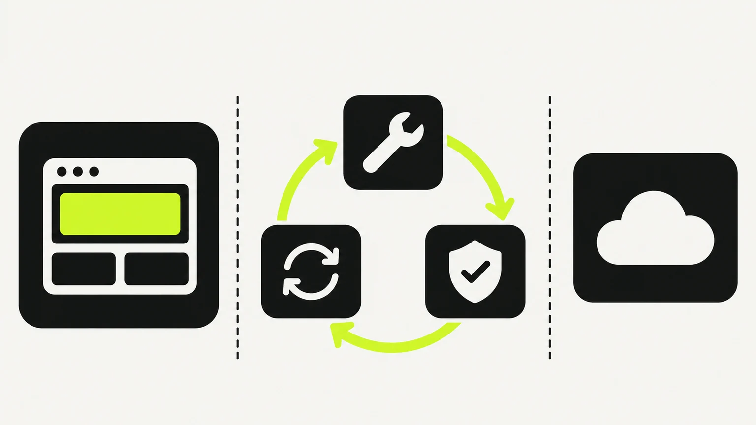
A one-time project and a continuing service are different commitments. Show them separately even when they are commonly bought together. Readers should be able to tell whether a recurring amount is optional support, required access or part of the core engagement.
Identify third-party costs when they are relevant to understanding the offer. A website project, for example, may involve a platform subscription, domain or separate software service. State who arranges and pays for each category using your actual agreement. Avoid publishing third-party prices unless you have checked and can maintain them.
If billing frequency can change, make the selected period explicit beside the amount. A smaller-looking monthly equivalent should not obscure a longer billing commitment. Check that any toggle updates the explanatory text as well as the number.
Have the responsible business owner verify currency, tax wording, payment conditions and other commercial details for the audience you serve. This article addresses presentation, not the legal or tax requirements of a particular jurisdiction.
An ongoing service also needs boundaries. Explain what happens after the initial project, which work enters the continuing arrangement and how additional requests are assessed. Our website retainer guide covers those operational questions without treating a monthly fee as unlimited capacity.
Put Important Conditions Where People Decide
A short card cannot contain every detail, but it can make the important ones visible. Prioritise the conditions most likely to change a buyer's understanding of the offer.
If supplied content is required, say so near the scope. If a separate assessment is needed before a fixed proposal, explain that near the action. If an optional service changes the work substantially, link to its explanation rather than placing a vague symbol beside the price.
Distinguish a dependency from a promise. Delivery timing may depend on access, supplied material and approval. Describe how the timeline is agreed instead of publishing a universal duration that the team cannot reliably meet.
Supporting detail can sit below the cards, but give it a useful heading and clear relationship to the relevant offer. A long general disclaimer is harder to interpret than a specific condition attached to the decision it affects.
Read the page in the order a new visitor encounters it. Note the first point at which each important condition appears. If a reader could reasonably form the wrong impression before reaching it, move the explanation earlier or change the initial claim.
Make the Comparison Readable Beyond a Desktop Screen
A wide comparison table may be easy to scan on a large display and awkward on a phone. Decide which information readers need side by side and which can be presented as a sequence of complete options. Do not simply shrink the desktop text until it fits.
When you use a genuine data table, its structure matters. The W3C tables tutorial explains that header cells and data cells need appropriate markup and relationships so assistive technology can retain context. A visually aligned grid alone does not establish those relationships.
For a short set of packages, separate sections may be simpler. Give each one a meaningful heading, an explanation of its audience and a clear action. The layout should remain understandable when decorative colour, animation or icons are absent.
The W3C writing guidance recommends descriptive headings and meaningful link text. Applied here, that means identifying the option and destination rather than repeating an unexplained action beneath several nearly identical panels.
Test long real content, not only short placeholders. Check that included features wrap cleanly, qualifiers remain readable and buttons do not cover the final line. Use keyboard navigation to reach package actions and any billing controls. A visual emphasis is useful only if the information remains available to other ways of using the page.
Carry the Selected Option Into the Enquiry
A package action should lead to the next step its label promises. If the service requires a conversation before a proposal, make that clear. Do not make a contact form look like a completed purchase or confirmed engagement.
When practical, carry the selected option into the enquiry form and let the visitor change it. That preserves context without assuming the initial choice is final. Show the selection in a readable field rather than relying solely on an invisible value that nobody can correct.
Ask for the information needed to assess fit. A bespoke service may need a short description of the project and its current situation. It rarely becomes clearer by asking someone to reproduce every detail of a full brief before an initial conversation.
Test the whole handoff: select an option, submit a clearly labelled test, confirm the receipt and check what the team actually receives. A page that communicates scope well still fails operationally if the selection disappears or the enquiry goes to an unmonitored inbox.
Use the website enquiry checklist to check that path. Keep testing separate from claims about results: a successful test proves the flow works for that scenario, not that the page has increased sales.
Maintain the Offer as One Source of Truth
Prices and inclusions often appear in several places: the homepage, a service page, a comparison section and a proposal template. Independent copies create opportunities for disagreement.
Assign an owner to approve changes and record which surfaces use the offer. Shared CMS content or a reusable component can reduce duplicate editing, but the team still needs to verify the underlying information. Reuse does not make an outdated scope correct.
Before publishing a change, compare the website with the current proposal process. Check that the sales conversation can deliver what the page promises. If a package has been retired, decide what happens to its links and any enquiries already carrying that selection.
Keep a small change record: the previous wording, what changed, when it went live and why. That makes later conversations about enquiry quality more grounded than relying on memory.
Measure comprehension as well as activity. Look for recurring misunderstandings in enquiries and whether visitors can explain the distinction between options. With low traffic, a small change in enquiry count does not establish the effect of the pricing section. Record traffic changes and other website edits before attributing a result to one design choice.
Next steps
Choose one offer and write its scope, price basis, exclusions and next action in plain language. Ask the person delivering it to confirm the details. Only then turn that information into cards, a comparison or a dedicated page.
We can help bring that structure into your website through our Framer website design service. Bring your current offers and the misunderstandings that appear in real enquiries, so the page can address the decisions your buyers actually face.


